Resource manager
Resources what?
PeakTMS allows to model diverse activities within your organization. Each of them have might have different relevant information to be managed and need different resources to take place. Below an example of typical resources in PeakTMS:
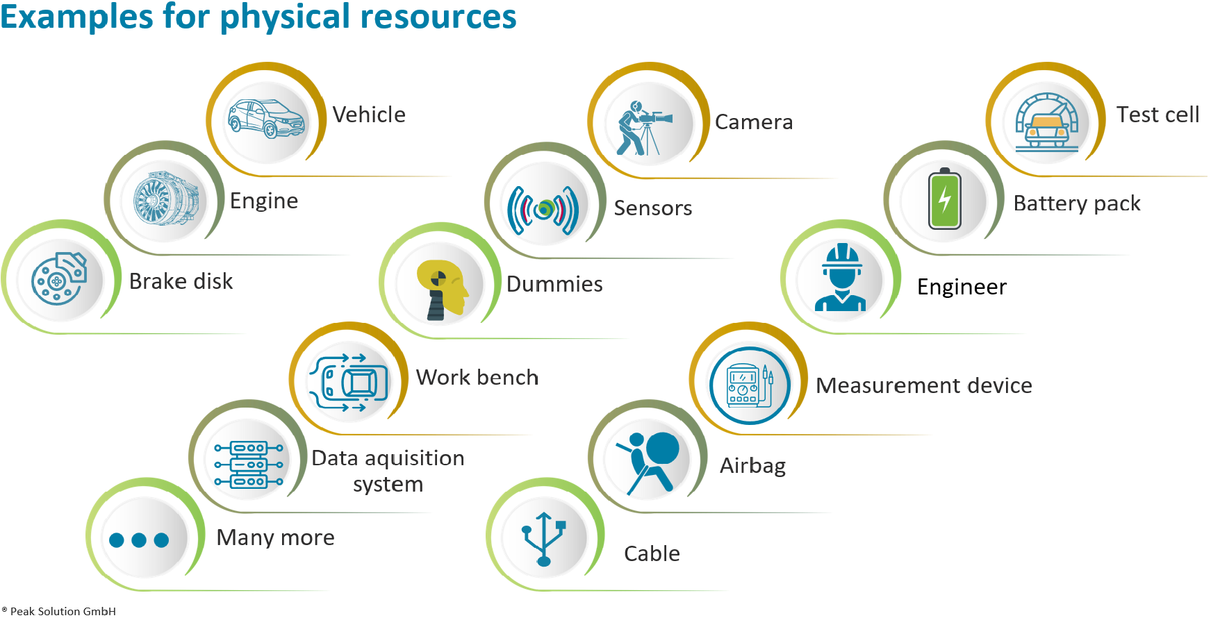
Typical PeakTMS resources
The available activities for your organisation and for you as user are defined and granted by your local administrator.
Resource manager
The resource manager allows you to create, maintain and search your diverse resources. The available resource types you will find in the tite menu below the entry 'resource':
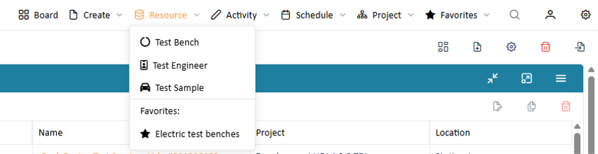
List of resources
If you miss some resource types than it might be that your administrator did not grant the necessary rights.
Below the resource types you find saved resource favorites, list of resources with user specific filters and table columns.
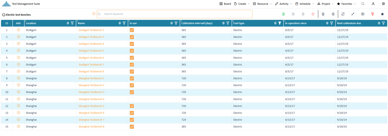
List of resources
Customize list view (General)
To fit list views to your needs to application provides you with powerful ways to customize your view.
List view customization
Filtering
To filter the shown data you can set a list of different filters.
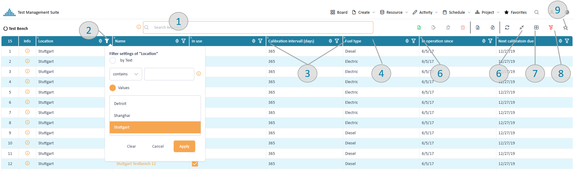
Key word filter (pic 1)
Entering one or several keyword expressions will search the entire data structure of each resource and add it to the filtered data. If you use several keywords, then they are "AND" connected. E.g. "Stuttgart electric" will only return data which contains Stuttgart and electric. Thereby both words can appear in different places of the resource.
Column filter (pic 2)
On top of the most columns the filter symbol provides filter options. Depending on the content type (e.g. text, number, date) different filter options will be provided. All column filter are "AND" connected therefore reducing the amount of shown data. Column filters can also be used together with the key word filter.
All filters can be cleaned using the clean-filter button (pic 8)
Adjust table columns
All columns can be adjusted in width by moving the separator between the column headers (pic 3). The order of the columns can be changed by you via dragging the column header to the desired position (pic 4). The button resize-table (pic 5) allows you to get your table back to screen size. A small 'x' at the left upper corner of each table header (pic 6).
With the column selector (pic 7) you can select additional columns to your table configuration.
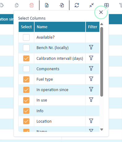
Column selector
Within the column chooser you can also set column filters. This becomes particular interesting if you want to filter data by a column but not see the column. E.g. if your filter all data by a just one location, there is no point to display that column in which each row has the same value.
Store your settings
The list view settings can be stored as favorite (pic 8). After saving the name of the list view will change according to your favorite name.
The stored favorites can be reused as data source for widgets in the dashboard.
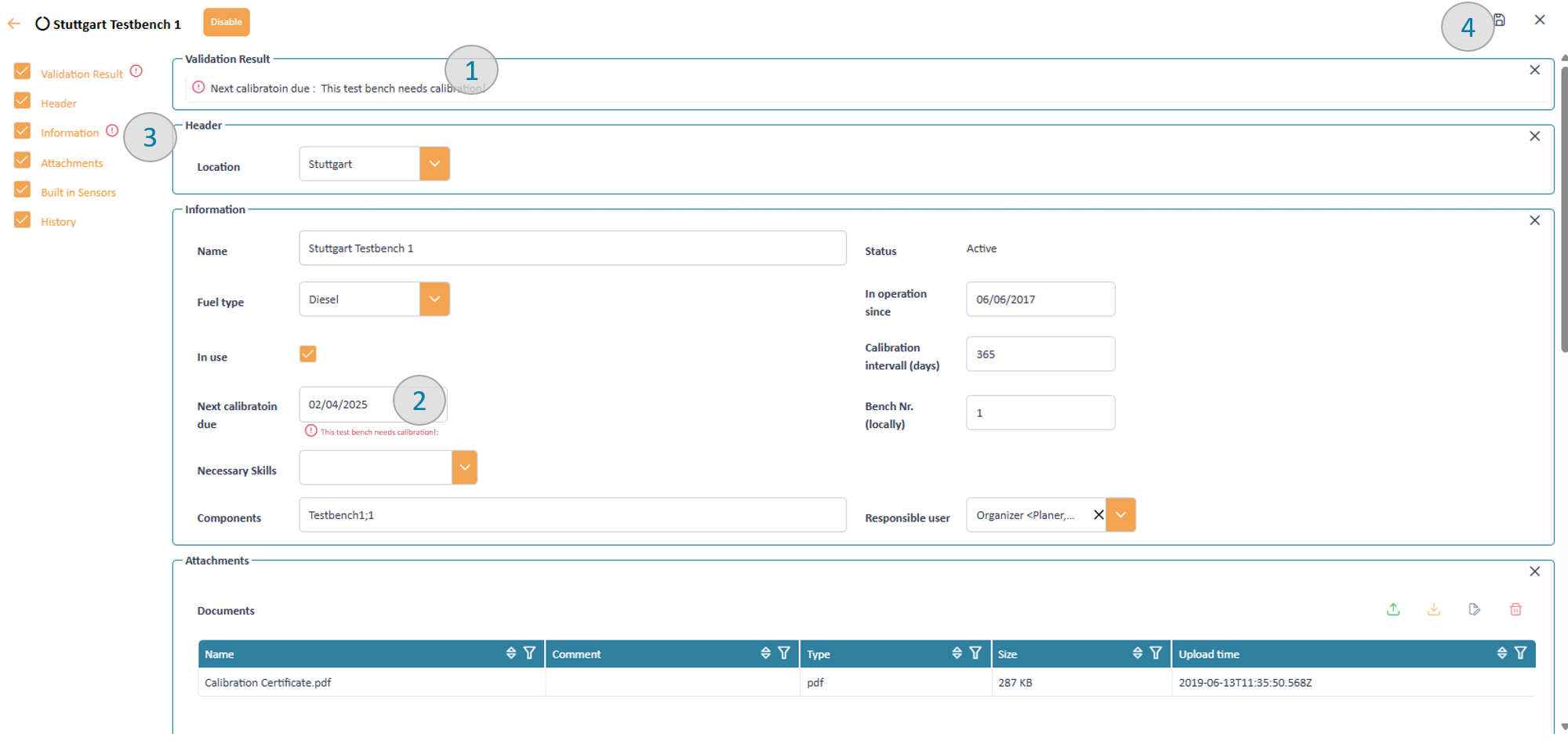
Inspect your resource details in the detail page
To get more information about a data row you have 3 options
- double click the row will open a dialog to display the selected data with the detail page
PeakTMS uses a generic page to provide you with the specific data. Depending on resource types the page might be simple with just a few basic information or complex with descriptions containing more than 100 attributes.
Detail page
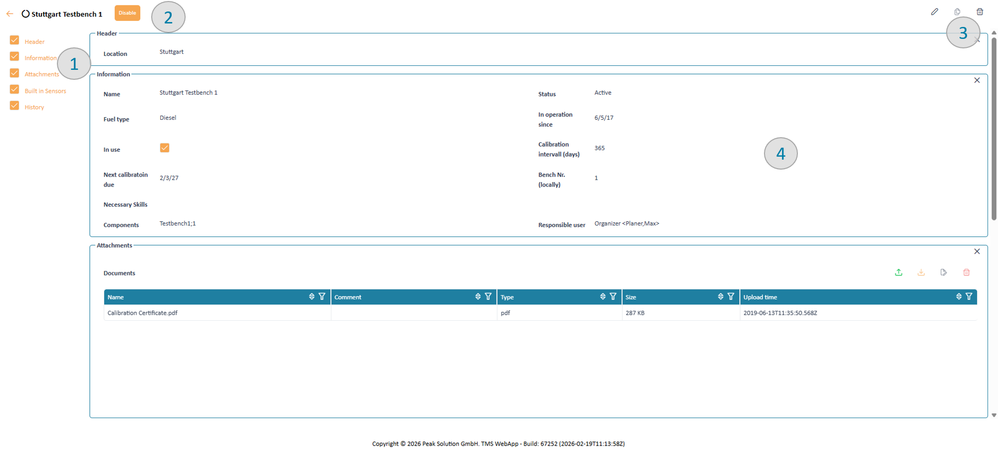
The page design includes 4 major areas:
Navigator (pic 1)
The navigator provides an overview over different data groups of information shown in the page. Via clicking on the links of the items in the navigator the system will scroll to the corresponding data group. Disabling the checkboxes in front of the items will remove the corresponding data groups from the visible screen. This allows to focus only on data aspects you are interested in. The settings will be remembered by the system until you log out.
Worfklow (pic 2)
At the left upper corner you might find some buttons to change the state of data according to the workflow configured by your administration. In case there are no buttons you either do not have the permissions or for the current data no workflow action is possible.
Editing toolbar (pic 3)
The toolbar at the left corner provides buttons to edit / copy and delete depending on your specific rights onto the data. In case a report has been defined you find a button to download relevant reports of the data.
Grouped data panel (pic 4)
In the center you find groups of all relevant data about the displayed resource.
History
If the log function is enabled for the resource type all changes since creation of the resources are listed in the history table. You can use filter functions to search for relevant changes by different system users.
Create or edit resources
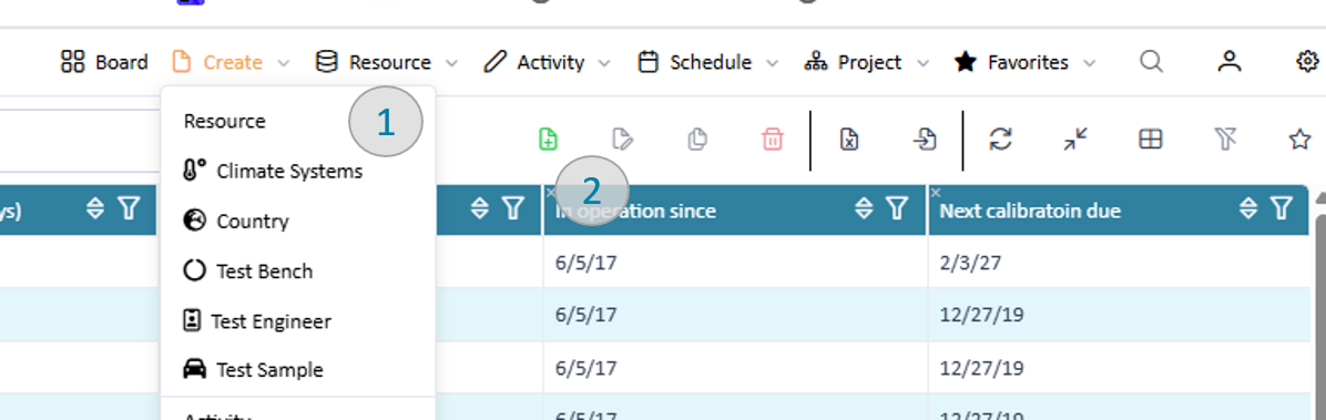
Create:
You can trigger the creation of new resources from the application menu 'create' (pic 1) and from the list view (pic 2)
Trigger new resource
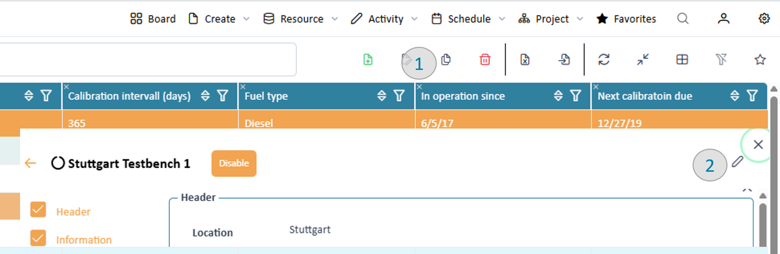
Edit:
You can start editing a resource using the edit button in the list view or detail page.
Trigger edit resource
In both cases you will enter the detail page in edit mode. The application will provide you with an assisted input form.
Trigger new resource
For each parameter the input form will provide an input field, if you have the rights to edit it. Whenever you edit a field a validation will be conducted. As a result of the validation the occoring warnings and errors will be displayed in the top validation area as summary (pic 1) and below each invalid field (2).
Additionally, the navigator will highlight data groups with in valid parameters (pic 3). If all errors are resolved (warnings might remain) you can save the resource (pic 4). Note that when finally saving a resource additional validations might be executed, depending on your organisation workflow.
Import resources
The application provides the functionality to import resources from a CSV file. Make sure that you are granted the rights for import. The import can be started in the list view of the resource type to be imported.
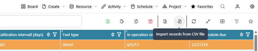
Trigger a resource import
The provided CSV File needs to fill following conditions:
- The first line specifying the column header need to fit the declared “name” of the resource attributes. (In former versions) declared as "Manual ID".
- it needs to include at least all mandatory attributes
- the columns are strictly comma separated ","
Following data types are supported for being imported via CSV:
BOOLEAN DATE DECIMAL MULTISELECT NUMBER STATUS ENGINE TEXT TEXT_LONG VALUE_LIST TEMPLATE_VALUELIST ROOT_VALUELIST USER After uploading the system will import. Only if all resources can be imported the import will be conducted otherwise the import will be aborted.
Export resources
Sie können die dargestellten Daten der Tabelle nach MS Excel exportieren. Dabei werden alle in der Tabelle angezeigten Spalten exportiert.
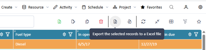
Trigger a resource export