Dashboard
Overview
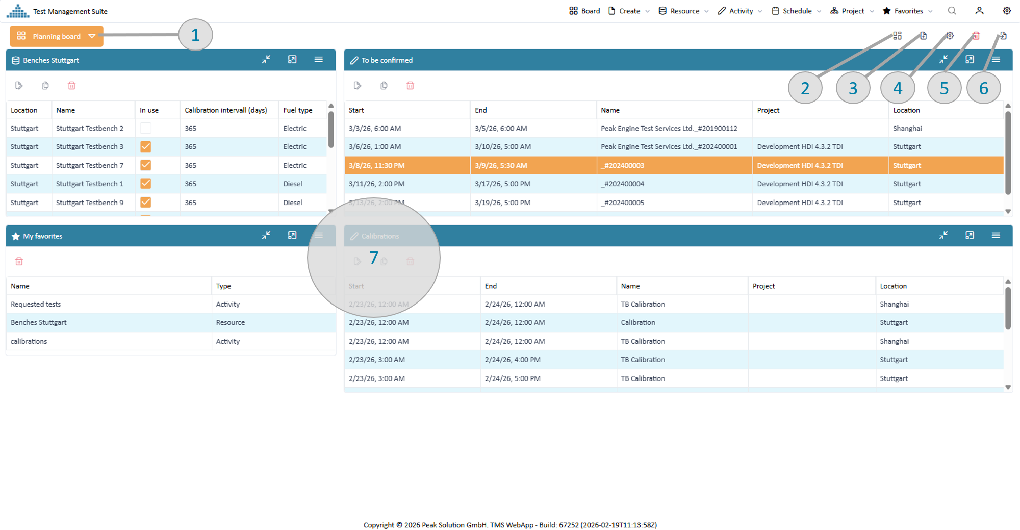
After login your starting point into the application is the dashboard. The dashboard is a collection of widgets which provide you with the most important information and links. The widgets can be placed on different places via drag and drop. Below an overview overt the most important components.
Summary Dashboard
In following different areas with their functions are described.
Switch between your dashboards
PeakTMS allows users to have 1 or several dashboards, e.g. for different purposes (planning board, approval board etc.) or devices (e.g. a mobile dashboard with reduced data). When pressing the switch board button the system will provide you with the defined boards and the function to create another new empty dashboard.
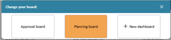
Switch dashboard
Define your dashboard layout
The dashboard layout is based on 3 columns. Through arranging the 3 columns lead to 5 different layouts.
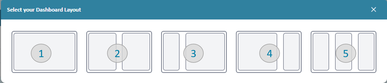
Switch dashboard
- All widgets are using the whole horizontal with. Gadgets are positioned below each other
- Widgets take 50% of the horizontal with
- Widgets on the left side take 25% width, on the right side 75% width
- Widgets on the left side take 75% width, on the right side 25% width
- All widgets use 1 third of the width
Example: The dashboard shown in the overview section is rendered with option 4. Depending on the layout the board will provide different places to drop widgets
Add a widget
To add a widget to the dashboard press the "add widget" button and choose which widget you would like to add. Afterward, the widget is positioned on the upper left of the board and can be customized and positioned within the dashboard layout.
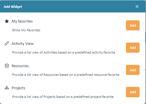
Add a new widget to the board
For a detailed description of the widgets please check the widget overview section.
Describe and share your dashboard
In case you are a key user other users can benefit from your settings. To describe and share your board you can change the board settings. Use a good name and description and select user groups which are allowed to use your board.
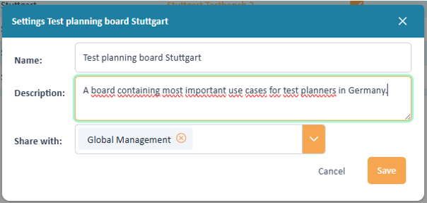
Describe and share your dashboard
Delete a dashboard
If you delete a dashboard all widgets will be deleted and the application will either switch to one of your other boards, or create a new empty board, in case there was no other existing dashboard.
When you delete a board, the favorites which habe been used by the widgets are not deleted. If those are of no use you need to delete them separately.
Import a dashboard
If a key user has made a dashboard available for your user group you can import it.
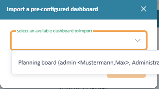
Import a dashboard
After confirming the application will import the new board and switch the board screen to the imported board.
Importing the board will not just import the widgets in there but also the favorites which are used by the widgets.
Widgets overview
The application provides you with different widgets which you can place onto your dashboards to provide you with information and starting points for actions. All of them have the following functionality
- They can be positioned via Drag % Drop
Example drag and drop
- They can be individually customized using settings
Example widget settings
- They can be minimized or maximized to be seen in full screen
Example fullscreen
Favorite widget
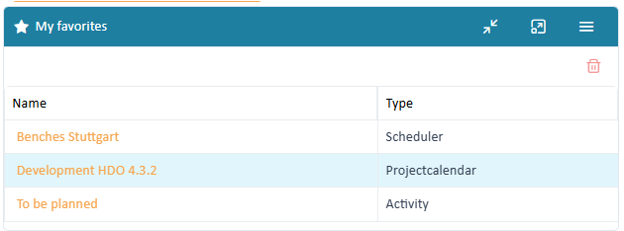
The favorite widget simply lists all your defined favorites and provides you link to open them. Clicking the delete button will delete the favorite.
Favorite widget
Number of rows Resource widget
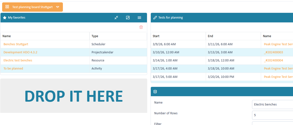
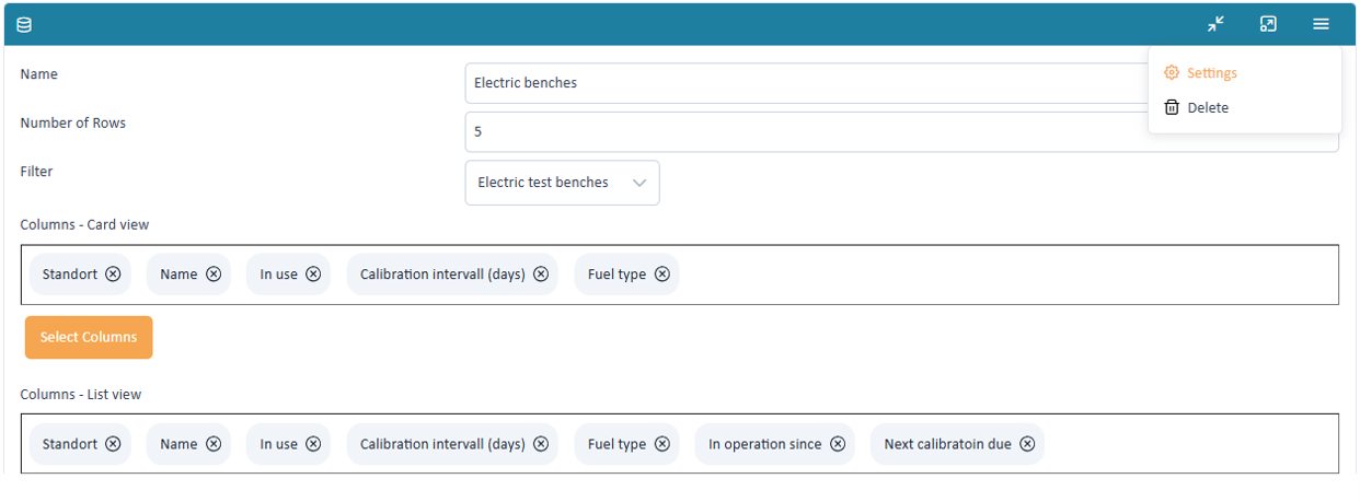
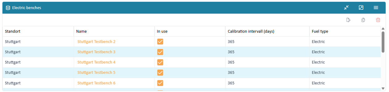
The resource widget allows to show list of specific resources and provides buttons for editing and delete. The example below shows an overview over electric benches.
Resource widget
Name Number of rows Filter Columns card view Columns list view Activity widget
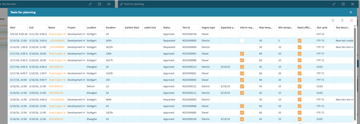
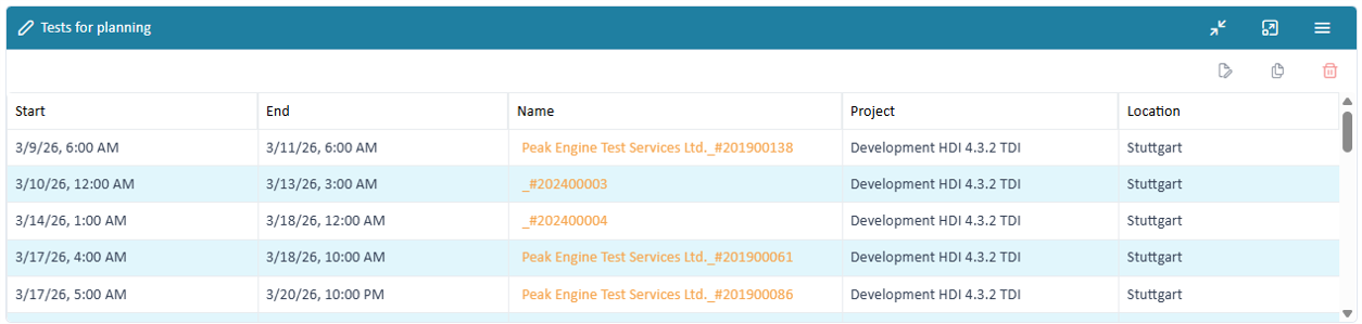
The activity widget allows to show list of specific activities and provides buttons for editing and delete. The example below shows an overview over tests.
Activity widget
Name Number of rows Filter Columns card view Columns list view Project widget
The activity widget allows to show list of specific activities and provides buttons for editing and delete. Additionally, it allows to directly open the project plan The example below shows an overview over projects.
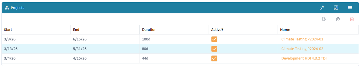
Project widget
Name Number of rows Filter Columns card view Columns list view