Analyzing Electric Motor Temperatures with ASAM ODS#
This example Notebook shows how to implement Kirgsn example notebook EDA and Baseline on Motor Temperature Estimation from Kaggl using ASAM ODSBox.
The data are collected by the LEA (Power Electronics and Electrical Drives) Department of the Paderborn University from a permanent magnet synchronous motor (PMSM) which is deployed on a test bench: Electric Motor Temperature.
The first sections are on initializing and connecting. The fun starts with “Load data”.
Dependencies for this notebook#
The ASAM ODSBox contains some functionality that wraps the ODS HTTP API making using Python easier ;-)
try:
  import odsbox
except:
  !pip install odsbox

from odsbox.con_i import ConI
Electric Motor Temperature#
Establish session#
The ODS HTTP API is a session based API. The session ID is called con_i in the ODS documentation. The ASAM ODSBox uses con_i as API object representing the session. Close this session to release the connection license. Otherwise the session will be auto closed after 30 minutes of inactivity.
con_i = ConI(url='https://docker.peak-solution.de:10032/api', auth=('Demo','mdm'))
Import Libs#
import numpy as np # linear algebra
import pandas as pd # data processing
import matplotlib.pyplot as plt
from matplotlib.colors import rgb2hex
import seaborn as sns
from sklearn.decomposition import PCA
Load Data#
The electric motor example data is stored in individual measurements starting with “Profile*” and we query für all (69) measurement (or more precisely their submatrices).
(We gave those measurements a random start date, which we use to order them by date…)
The mass data hasn’t been touched yet and we can examine it a bit before we actually load it - a bit like
shapeon steroids.
mea_lenghts = con_i.query_data({
    "SubMatrix": {"measurement.test.Name": {"$like": "Profile*"}},
    "$attributes": {
        "measurement.Name": 1,
        "SubMatrixNoRows": 1
    },
    "$orderby": {
        "measurement.measurement_begin": 1
    }
})

mea_lenghts = mea_lenghts.set_index(mea_lenghts.columns[0])
print(mea_lenghts.head())
                SubMatrix.SubMatrixNoRows
MeaResult.Name
Profile_17                          15964
Profile_05                          14788
Profile_12                          21942
Profile_32                          20960
Profile_21                          17321
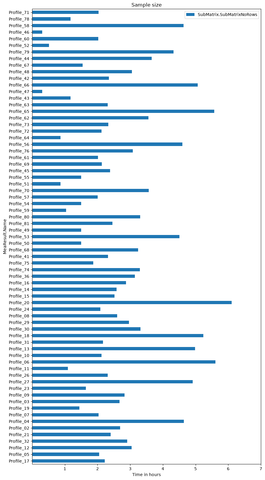
Plot sample size
ax = mea_lenghts.plot.barh(figsize=(10, 20), title='Sample size')
_ = ax.set_xticks(2*3600*np.arange(1, 8)) # 2Hz sample rate
_ = ax.set_xticklabels(list(range(1, 8)))
_ = ax.set_xlabel('Time in hours')
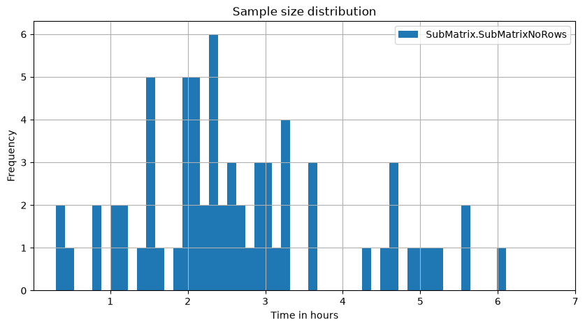
Plot sample size distribution
ax = mea_lenghts.plot.hist(title='Sample size distribution', bins=50, figsize=(10, 5), grid=True)
_ = ax.set_xticks(2*3600*np.arange(1, 8)) # 2Hz sample rate
_ = ax.set_xticklabels(list(range(1, 8)))
_ = ax.set_xlabel('Time in hours')
Distributions#
Until now, we haven’t loaded any mass data, yet.
In our data model, the individual profiles are not contained in a big single dataset. They are stored profile by profile in so called submatrices (we looked at them before a bit). So we go and fetch the first profile returned as DataFrame by using con_i.bulk.data_read(...).
data_matrices = con_i.query_data({
    "SubMatrix": {"measurement.name": "Profile_68"},
    "$attributes": {
        "measurement.Name": 1,
        "Id": 1
    }
})

# just pick the first one
dm_id = data_matrices["SubMatrix.Id"][0]
profile_name = data_matrices["MeaResult.Name"][0]

print(profile_name)

dm_df =  con_i.bulk.data_read(dm_id)

dm_df.head()
Profile_68
| U_q | Coolant | Stator_winding | U_d | Stator_tooth | Motor_speed | I_d | I_q | Pm | Stator_yoke | Ambient | Torque | |
|---|---|---|---|---|---|---|---|---|---|---|---|---|
| Time | ||||||||||||
| 0.0 | -1.250622 | 26.948739 | 26.401552 | -0.269267 | 26.165591 | -0.003114 | -2.000875 | 1.097745 | 28.011248 | 26.141670 | 26.280088 | 2.785112e-07 |
| 0.5 | -0.510442 | 26.950800 | 26.396721 | 0.110050 | 26.172235 | 21.150647 | -4.751546 | -14.421556 | 28.002123 | 26.155253 | 26.275925 | -1.122167e+01 |
| 1.0 | -0.388580 | 26.953776 | 26.408694 | 0.907830 | 26.177153 | 42.000488 | -15.815420 | -49.228154 | 27.996198 | 26.159354 | 26.280659 | -3.799358e+01 |
| 1.5 | -0.260576 | 26.962654 | 26.401838 | 1.678359 | 26.181832 | 60.023822 | -25.347121 | -77.327501 | 27.993540 | 26.173699 | 26.280193 | -5.986944e+01 |
| 2.0 | 0.134215 | 26.948778 | 26.396926 | 2.581367 | 26.172657 | 80.657265 | -32.076248 | -97.315560 | 28.001602 | 26.181490 | 26.277929 | -7.541367e+01 |
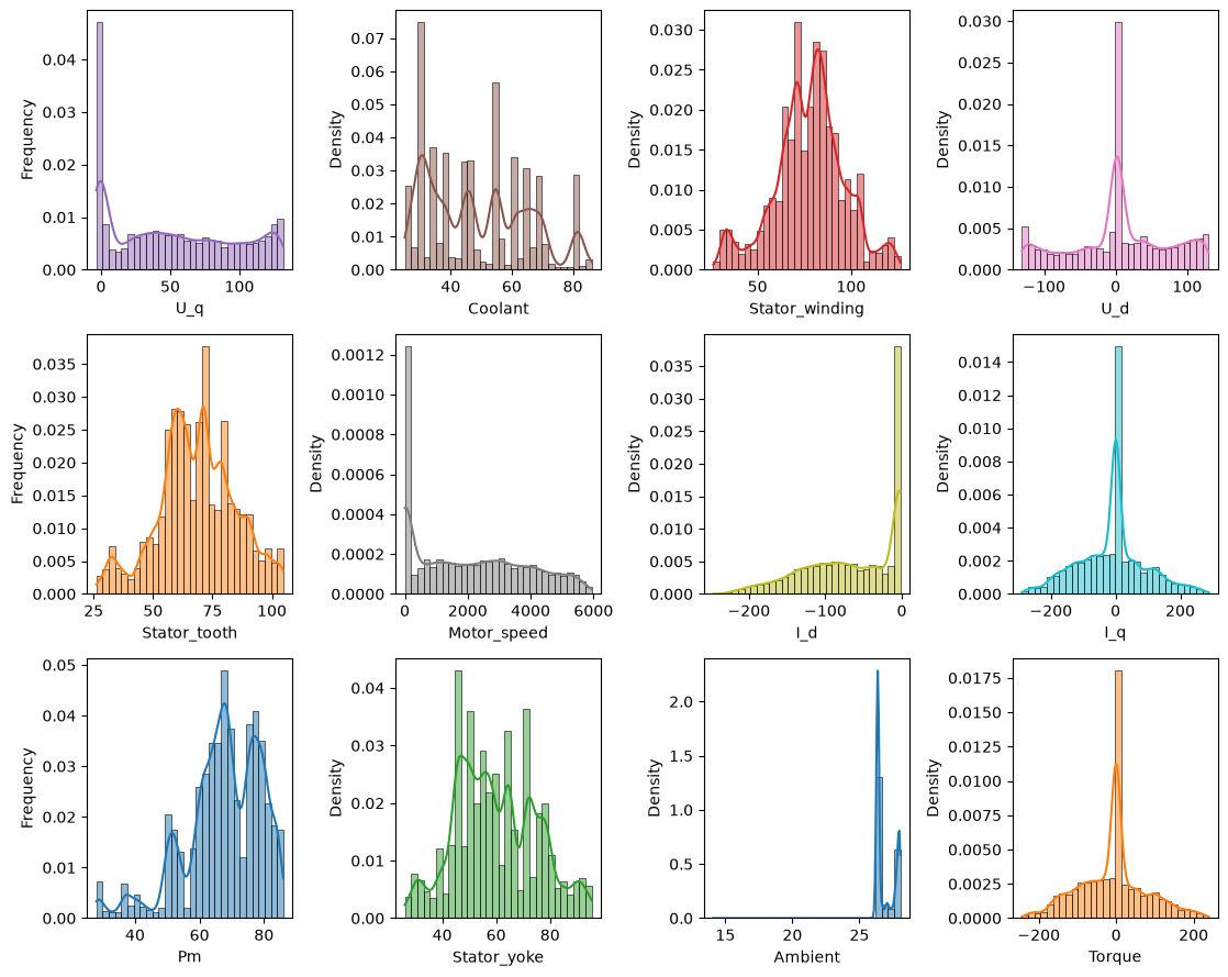
… and now plot the distribution ….
target_features = ['Pm', 'Stator_tooth', 'Stator_yoke', 'Stator_winding']

# prepare colors
color_list = plt.cm.tab10(np.linspace(0, 1, 10)[list(range(10))+[0, 1]])
coi = target_features + [c for c in dm_df if c not in target_features]  # columns of interest
feat_clrs = {k: rgb2hex(color_list[i][:3]) for i, k in enumerate(coi)} if color_list is not None else {}

n_cols = 4
n_rows = np.ceil(dm_df.shape[1] / n_cols).astype(int)
fig, axes = plt.subplots(n_rows, n_cols, figsize=(2.8*n_cols, n_rows*3))
for i, (ax, col) in enumerate(zip(axes.flatten(), list(dm_df.columns))):
    sns.histplot(dm_df[col], kde=True, stat="density", ax=ax, color=feat_clrs[col], bins=30)
    if i % n_cols == 0:
        ax.set_ylabel('Frequency')
plt.tight_layout()
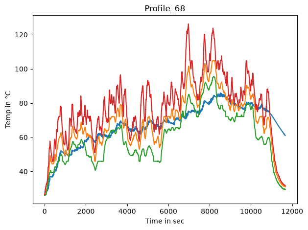
Time series gestalt#
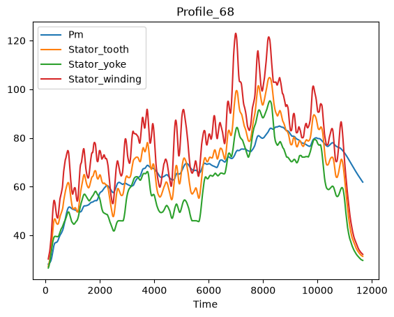
First we’ll get an overview of the target temperature trends.
dm_df = con_i.bulk.data_read(dm_id)

coi = target_features
fig, ax = plt.subplots()
for c in coi:
    lines = ax.plot(dm_df[c], label=c, color=feat_clrs[c])
ax.set_title(profile_name)
ax.set_ylabel('Temp in °C')
ax.set_xlabel('Time in sec')

fig.tight_layout()
# _ = ax.legend(ncol=15, loc='lower center', bbox_to_anchor=(.5, 1), bbox_transform=fig.transFigure)
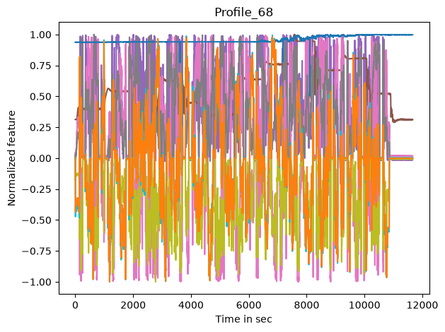
Now we have a look at the input features
coi = [c for c in dm_df if c not in target_features]
max_values_per_col = dm_df.abs().max(axis=0)
fig, ax = plt.subplots()
for c in coi:
    lines = ax.plot(dm_df[c]/max_values_per_col[c], label=c, color=feat_clrs[c])
ax.set_title(profile_name)
ax.set_ylabel('Normalized feature')
ax.set_xlabel('Time in sec')
fig.tight_layout()
#_ = ax.legend(ncol=15, loc='lower center', bbox_to_anchor=(.5, 1), bbox_transform=fig.transFigure)
_ = dm_df[target_features].rolling(200).mean().plot(kind="line", subplots=False, title=profile_name)
_ = dm_df.drop(target_features,axis=1).rolling(200).mean().plot(kind="line", subplots=True, layout=(4,2), title=profile_name)
Operation points#
The operation point of a motor is often explained by its location in the motor_speed-torque-plane.
fig, ax = plt.subplots()
_ = ax.plot(dm_df['Motor_speed'], dm_df['Torque'])
_ = ax.set_title(profile_name)
_ = ax.set_ylabel('Torque in Nm')
_ = ax.set_xlabel('Motor speed in rpm')
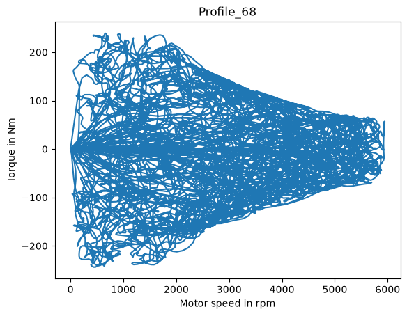
We see that some driving cycles only capture little of the valid operation region, while other profiles do comprehensive random walks over the full operative range.
Note that motors are power rated, and since power is defined as P=motorspeed⋅torque, there are elliptical borders that can’t be exceeded.
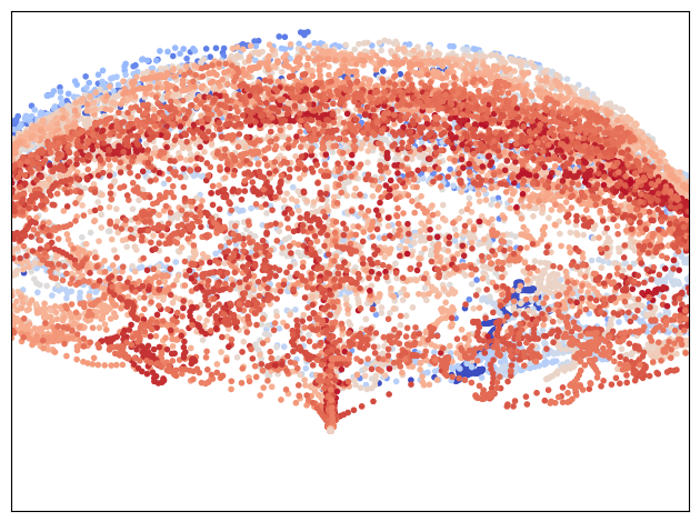
Dimensionality reduced visualization#
Depict the sessions principal component axes, shifting the color from blue to red as the permanent magnet temperature rises.
Showing the two most significant principal components.
# normalize
dm_df = con_i.bulk.data_read(dm_id, set_independent_as_index=False)

dm_df = dm_df / dm_df.abs().max(axis=0)
transformed = PCA().fit_transform(dm_df.drop(target_features, axis=1))
sess_df = dm_df
_trans = transformed[sess_df.index, :]
plt.scatter(_trans[:, 0], _trans[:, 1], c=dm_df.loc[sess_df.index, 'Pm'].values, cmap=plt.get_cmap('coolwarm'), marker='.', vmin=dm_df['Pm'].min(), vmax=dm_df['Pm'].max())
plt.xlim(-1, 1)
plt.ylim(-1, 1)
plt.tick_params(axis='both', which='both', bottom=False, top=False,
                        labelbottom=False, right=False, left=False,
                        labelleft=False)
plt.tight_layout()
Close session#
Don’t forget to close the session to release the connection license. Otherwise the session will be auto closed after 30 minutes of inactivity.
con_i.logout()
Acknowledgement#
The data used by this notebook is based on the Kaggle Electric Motor Temperature data provided by Paderborn University under the CC BY-SA 4.0-License
License#
Copyright © 2025 Peak Solution GmbH
The training material in this repository is licensed under a Creative Commons BY-NC-SA 4.0 license. See LICENSE file for more information.
Notebook: 📓 Back to ASAM ODS Overview